Microsoft Excel: Building Dynamic Dashboards
Introduction
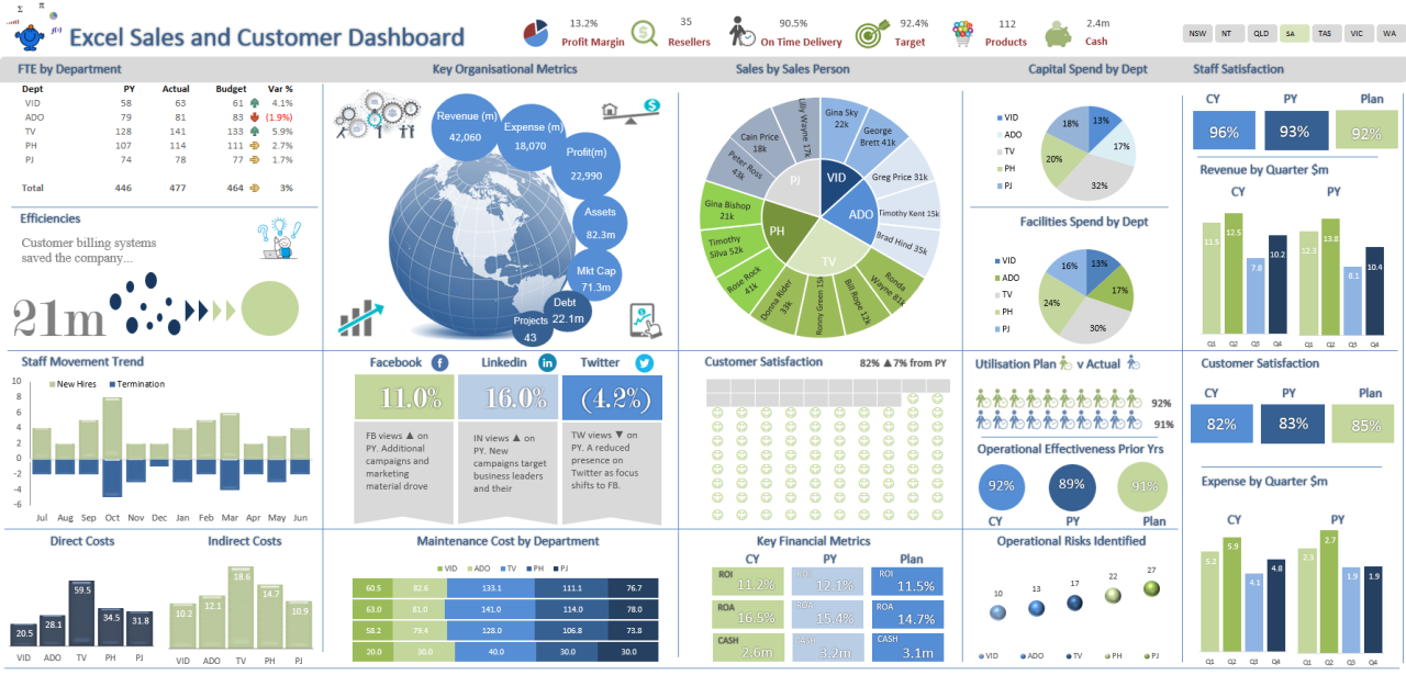
Data visualization is crucial for comprehending complex data and making informed decisions. Microsoft Excel offers a comprehensive feature set for creating dynamic dashboards that transform raw data into insightful visual representations. This article will guide you through the process of building dynamic dashboards in Excel to enhance your data analysis capabilities.
What is a Dynamic Dashboard?
A dynamic dashboard is an interactive data visualization that displays key metrics and trends in a visually appealing and customizable format. It allows users to interact with the data, filter it, and drill down to specific details, providing a comprehensive view of the data.
Creating a Dynamic Dashboard
1. Collect and Prepare Data:
Gather the necessary data from various sources and ensure it is clean, organized, and structured for effective visualization.
2. Create Data Model:
Organize the data in a coherent manner using Excel’s Power Pivot tool. This creates a data model that serves as the foundation for your dashboard.
3. Design Dashboard Layout:
Determine the layout of your dashboard, including the charts, graphs, and tables you want to display. Use charts to represent data in visually appealing formats, such as bar charts, pie charts, or line graphs.
4. Create Measures and KPIs:
Define key performance indicators (KPIs) and other measures that you want to track on your dashboard. These metrics will provide insights into the performance of your business or organization.
5. Use Slicers and Filters:
Add slicers and filters to allow users to interact with the dashboard. This enables them to filter data based on specific criteria, such as date, region, or product category.
6. Create Calculated Fields:
Enhance your dashboard by creating calculated fields that perform calculations on the data. This allows you to derive new insights and display them in a visually meaningful way.
7. Format and Customize:
Apply formatting and customization to make your dashboard aesthetically pleasing and user-friendly. Use conditional formatting to highlight important trends and anomalies.
Benefits of Dynamic Dashboards
- Increased Data Visibility: Provide a comprehensive view of key metrics and trends, making it easier to identify areas for improvement.
- Enhanced Decision-Making: Allow users to interact with the data, explore different scenarios, and make informed decisions based on data insights.
- Improved Communication: Communicate complex information effectively to stakeholders through visually appealing dashboards that simplify data interpretation.
- Real-Time Updates: Enable dashboards to refresh automatically with updated data, providing the most current insights.
- Increased Efficiency: Save time and effort by automating data analysis and visualization tasks, freeing up valuable resources for other activities.
Conclusion
Building dynamic dashboards in Microsoft Excel is a powerful tool that can help you unlock the insights hidden within your data. By following the steps outlined in this article, you can create visually engaging and interactive dashboards that empower you to make informed decisions, improve performance, and communicate data effectively.


