Microsoft Excel: Visualizing Data with Charts
Charts are a powerful tool for visually representing data in Microsoft Excel. They allow you to quickly and easily understand the patterns and trends in your data, making it easier to draw conclusions and make informed decisions.
Creating a Chart
To create a chart in Excel, simply select the data you want to chart and then click the "Insert" tab. In the "Charts" group, you will find a variety of chart types to choose from.
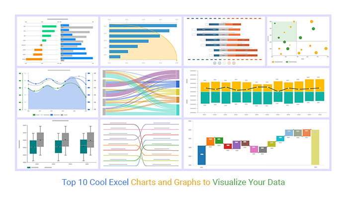
The most common chart types include:
- Line charts: Show the relationship between two or more variables over time.
- Bar charts: Compare the values of different categories.
- Pie charts: Show the proportion of a whole that each category represents.
- Scatter plots: Show the relationship between two numerical variables.
Once you have selected a chart type, Excel will automatically create the chart and insert it into your worksheet.
Customizing Charts
Once you have created a chart, you can customize it to meet your needs. You can change the chart type, the data series, the colors, and the layout.
To customize a chart, simply click on it to select it. Then, click on the "Chart Design" tab. Here, you will find a variety of options for customizing your chart.
Using Charts to Analyze Data
Charts are a powerful tool for analyzing data. They can help you to:
- Identify trends: Charts can help you to see the overall trend of your data. This can be helpful for identifying areas of growth or decline.
- Compare data: Charts can help you to compare the values of different categories. This can be helpful for understanding the relationship between different variables.
- Make predictions: Charts can help you to make predictions about future trends. This can be helpful for planning and decision-making.
Conclusion
Charts are a powerful tool for visualizing data in Microsoft Excel. They can help you to quickly and easily understand the patterns and trends in your data, making it easier to draw conclusions and make informed decisions.