Microsoft Excel: Advanced Chart Customization
Charts are a powerful way to visualize data and communicate insights. Microsoft Excel offers a wide range of customization options to help you create charts that are both informative and visually appealing. This article will explore some of the most advanced chart customization techniques in Excel.
Formatting the Chart Area
- Fill: Choose the background color, gradient, or image for the chart area.
- Border: Add a line around the chart area, customize its color, thickness, and style.
- Shadow: Create a 3D effect by adding a shadow to the chart area.
Customizing the Axes
- Axis Titles: Add custom titles to the horizontal and vertical axes.
- Axis Labels: Adjust the font, size, and color of the axis labels.
- Gridlines: Customize the appearance of the gridlines, including their color, line style, and spacing.
- Scale: Set the minimum and maximum values for the axes, as well as the major and minor tick marks.
Formatting the Data Series
- Shape and Color: Choose the shape and color for each data series in the chart.
- Marker: Add a marker to each data point, customize its shape, size, and color.
- Trendline: Add a trendline to display a line or curve that shows the trend in the data.
- Data Labels: Add labels to each data point, displaying the value or category.
Adding Chart Elements
- Title: Add a title to the chart that accurately summarizes the data presented.
- Legend: Create a legend to identify the different data series in the chart.
- Plot Area: Add additional plot areas to the chart to display multiple series on different axes.
- Annotation: Include text boxes, arrows, or shapes to provide additional context or highlight specific data points.
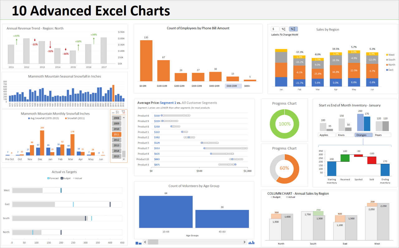
Advanced Customization
- 3D Effects: Create 3D charts to add depth and perspective to your visualizations.
- Sparklines: Insert small embedded charts into cells to display data trends at a glance.
- Dynamic Charts: Link chart data to cells in the worksheet to automatically update the chart as the data changes.
- Chart Templates: Use predefined chart templates to quickly create professional-looking charts.
Tips for Effective Chart Customization
- Keep it Simple: Avoid overcrowding the chart with too many elements.
- Use Color Effectively: Choose colors that are both visually appealing and easy to distinguish.
- Label Clearly: Add clear and concise labels to all chart elements.
- Use a Consistent Style: Maintain a consistent style and font throughout the entire chart.
- Test and Iterate: Experiment with different customization options to find the best fit for your data and audience.
Conclusion
Microsoft Excel provides a robust set of tools for advanced chart customization, allowing you to create visually impactful and informative visualizations. By mastering these techniques, you can effectively communicate data insights and enhance the decision-making process. Remember to keep it simple, use color effectively, label clearly, maintain consistency, and test and iterate for the best results.